Copy of Waste Management Redesign
We redesigned the two Waste Management sites, one in the United States and one in Canada in the spring of 2015. The major goal of this rework was to reduce the number of calls.
̌
Waste Management
Deloitte Digital | 3 months in 2015 | Web Design
Overview
Alongside another UX designer, a Visual Designer and a Creative Director, we sought to improve the ability for self-service on the site and thus reduce the number of customer service calls. On the U.S. site, we redesigned the site navigation, information architecture, landing page, and authenticated state. We did a full redesign of the Canada site. For both sites, we needed to consider residential versus business customers, though our main focus was on residential. The site launched 6 months after we had rolled off, and it was very close to the designs we provided. We have maintained an excellent relationship with this client, with plans to work together again.
My Role
My main contributions included: site analytics analysis, user research analysis, journey mapping exercise lead, wireframing, information architecture, and user flows. Feedback to and close collaboration with visual designer.
Process
Discovery
For the first two weeks, we focused on the discovery phase. We led an on-site two-day workshop with the client to uncover client goals and their perception of user needs. We also held user interviews, current site analysis, including site analytics, and a card-sorting exercise.
Design
The initial design phase ran about eight weeks. Myself and the other UX Designer created user flows, wireframes, the information architecture for the site (including a sitemap). We presented our designs for review bi-weekly with the client and held daily stand-ups.
Iterate
During the last two weeks of the project, we were able to iterate and build on our design. We ran small-scale user-testing & re-design. We presented our final design on-site with the client.
Discovery
On-Site Workshop
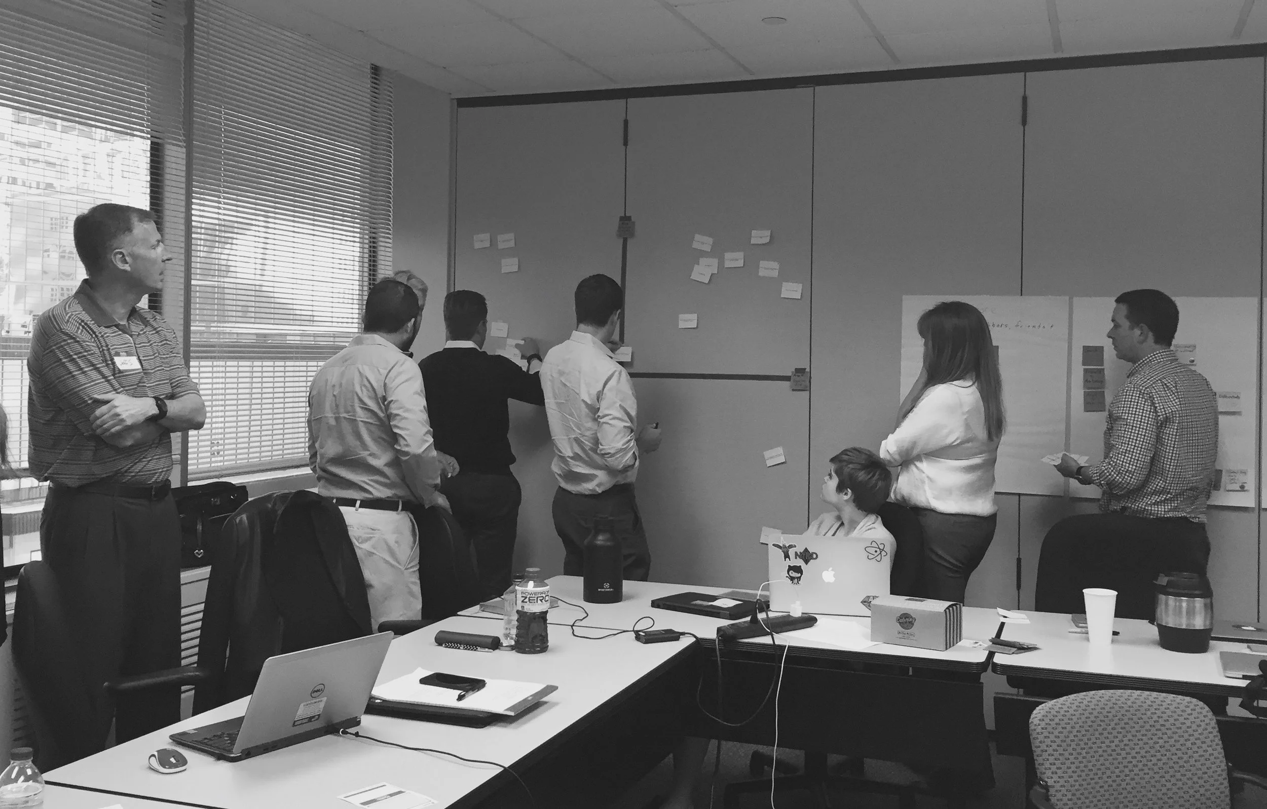
We began this project with an on-site two day Discovery workshop with the client including Tweet Like Me, Social Listening, Journey Mapping, Treasure Hunt, Priority Map, Emotional Resonance & Moodboard, Competitive Analysis, Stakeholder "Speed-dating", Card-sorting, How Might We’s, Agile Methodology and Epics, In-person Prototyping, User Stories & Acceptance Criteria. From this workshop we built a relationship with the client and were able to understand their perspective on the needs of their users and how they would measure success. Our main findings were that the client wanted this product to be
User Interviews
We did small scale user interviews to gain some insight to who users were and how/why they were coming to the website. We found that users tended to come to the site under two main conditions. For one, they would come to the site during transitions, i.e. when they were moving to or from a house with Waste Management as a provider. Secondly they would come when they needed a very specific piece of information, such as how a holiday or inclement weather might affect their pick-up. Since their visits were infrequent, we needed to ensure these tasks were easy to find and would not require any learning. Depending on the setup, some users had to come to the website to pay bills as well, so this would also be a main task.
Content Audit and Site Analytics
Site Analytics: Contact Us Next Page Flow
I performed the content audit and analyzed the site analytics. We were able to discover parts of the site that were largely under-used as well as understand user patterns.
For the content audit, I used a site crawler, the Content Analysis Tool from Content Insight, as well as went through the top three levels of navigation and determined how many different components they were using across the site. We found that there were 13 levels on the site and of just under 9000 URLs, 1500 were PDFs. We advised fewer levels of content and also to reduce the number of PDFs.
We analyzed the Next Page Flow (on the left) from Contact Us to try and understand why users may be calling customer service.
- 25% go to Find a Facility, meaning they were likely looking for a nearby facility, either to drop off trash or maybe to ensure they call the local office.
- 18% leave the site. Only actionable item on the Contact Page is to email support, so those who leave either sent an email or gave up.
- 12% go to Report a Problem.
Card-Sorting
If it hasn't become apparent yet, I love numbers and complex analysis. The results of the card-sort were a dream come true! Okay, maybe not quite that exciting. To the left is a similarity matrix and dendogram. My fellow UX-er and myself spent an afternoon dissecting these results and sketching out possible navigation solutions.
Our main findings were were:
- People mentally group items together if they contain one same word
- If they don’t belong together, perhaps one should be renamed. Alternatively, two similar items can and should have similar names.
- Ensure titles are descriptive and intuitive
- Cards occasionally in wrong place due to unintuitive title, i.e. “Commitment to Safety”. We advise “Employee Safety and Training”
- Participants grouped by service/product type
- Most participants did not distinguish between residential and home services, except when it came to construction services.
- Participants did not group Help Center with My Account
- Participants created same “My Account” category except without the Help Center.
Design
Sitemap
The sitemap was extremely deep, and took a long time to go through and document first the current state, and then using the card-sorting results, create our recommendation.
Wireframes
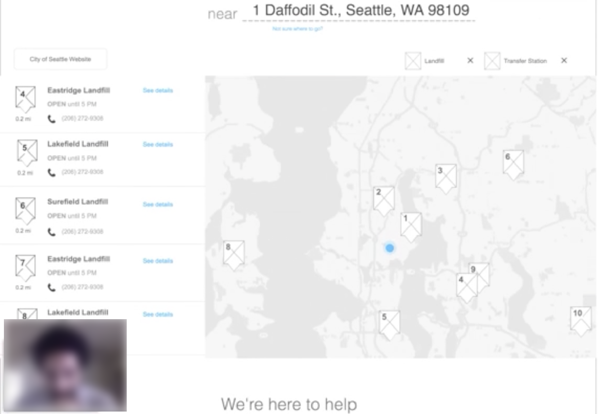
The other UX designer and myself split parts of the experience and took on pieces to design. For example, I designed the user's authenticated experience. What would they see and need to accomplish once logged in? See example below.
Iterate
Usability Test
We performed remote user-testing with four residential open market / municipality users using a tool called Validately. We found that users appreciated the natural language, as well as the transparency on the logged in state. They also wanted more explicit information on specific items: Does this drop-off location except [couches]? The users we tested wanted to ensure they didn't waste time driving to a location for nothing.
We implemented the feedback we got into our final design, and handed over the assets after a very busy 12 weeks.
Conclusion
The site launched about 6 months later, and you can see most of our design implemented at wm.com, and our more blue-sky future state design at wmcanada.com. We are currently in discussions with Waste Management about starting up another project with them since they were so happy with our team and the work we produced.